
Hawkins: Netflix’s Design System
Creating new and optimizing existing components for Netflix Consumer, across TV, mobile, and web, while considering animation, tokens, and accessibility.
Duration: 8 months
Team: Manuela Odell, product designer; Josh Mateo, design manager, product design, Matt da Silva, senior product designer, Mars Julian, software engineer (web), Danelle Vermeulen, senior motion designer ...and many more)
Overview
Netflix has a small but mighty design systems team, across consumer and professional. We are about four full time designers strictly working on Hawkins. This includes educating designers, creating processes as we scale, updating existing components, creating new components, all while making sure to consider engineering considerations, motion, and accessibility.
There was a product mandate for designers at Netflix to leverage Hawkins as much as possible. However, that requires our team to be fast and nimble and to have a strong pulse on the needs of our designers.
The Hawkins team are rockstars and it is the privilege of my life to be able to have contributed.
Below, I share a component I worked on. For more on my time at Netflix, please reach out to me directly.
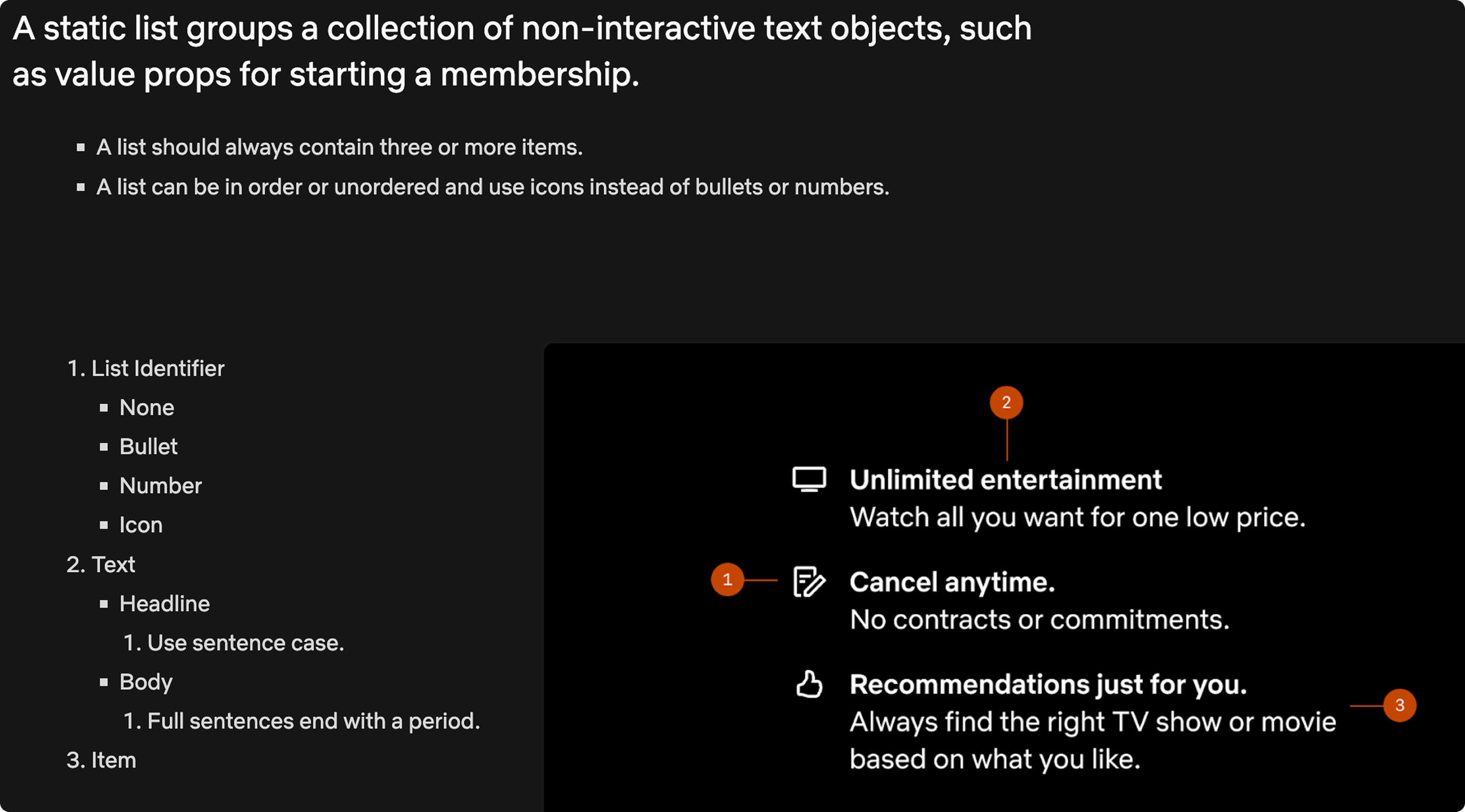
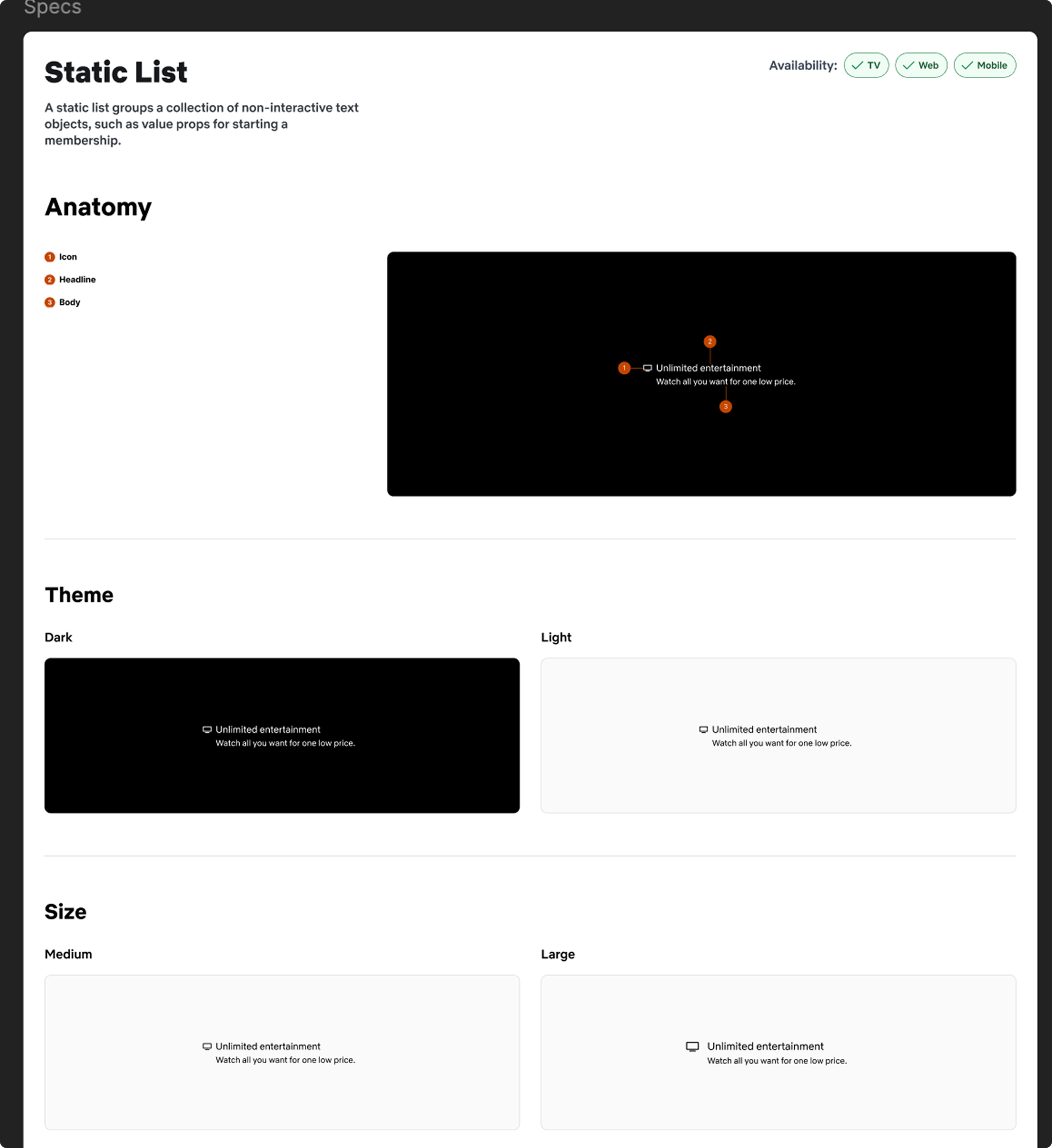
Static List
Team: Lead DF designer: Manuela, Feature team designers: Mete & Ash Grigas; Schema alignment: David Aragon; Developers: Fernando Nova (TV); Noah Blake & Stella Yan (Mobile), Mars & Kyle (web)
Platform: Web, mobile, TV
The challenge & business case
Two teams focused on growth on TV need the [static list] component. However, the smallest size of this component does not fit on TV, especially when considering localization (in other languages).
Additionally they wanted some color flexibility to highlight certain words because in testing, they learned that growth increased when certain words were emphasized through formatting or color.
Research
First I sat down with Ash & Mete to understand their needs for the component. I also made sure to include Fernando as he is the developer on TV.
Static List was only available in one color (foreground), they wanted it available in foreground-subtle.
Additionally, the smallest Static List side was too large for full screen on TV, especially when considering localizationMete was using full TV screen for his card so there was no more vertical space, spacing was very important.
Also wanted the ability to change text weight to play with information hierarchy
Decided to look at how the component was being used across platforms to figure out what changes we could make
Found that *emphasis*, a variant in which a body text appears below the headline, was not productized at all, except in IMS Templates which is technically built in code and is available to other feature designers to use
Current design:
Feedback
When designing on TV, the smallest <static list> size was too big to fit vertically, especially when considering localization.
The way <static list> was being used was in a comparative setting, so allowing for color overrides is very important.
Rich formatting is important because when skimming listed information, highlighting certain words helps clarify the value props.
Design
When designing on TV, the smallest <static list> size was too big to fit vertically, especially when considering localization.
The way <static list> was being used was in a comparative setting, so allowing for color overrides is very important.
Rich formatting is important because when skimming listed information, highlighting certain words helps clarify the value props.

Proposed design:
Remove emphasis which bolds the text and adds body text
Turn emphasis into a color change (high/low)
Add a small variant
Create some spacing changes
Implementation
Once the design & spec had been approved by the rest of the team, it was time to work with the developers to implement the design.
First I added all relevant tokens, across color, typography, and dimensions.